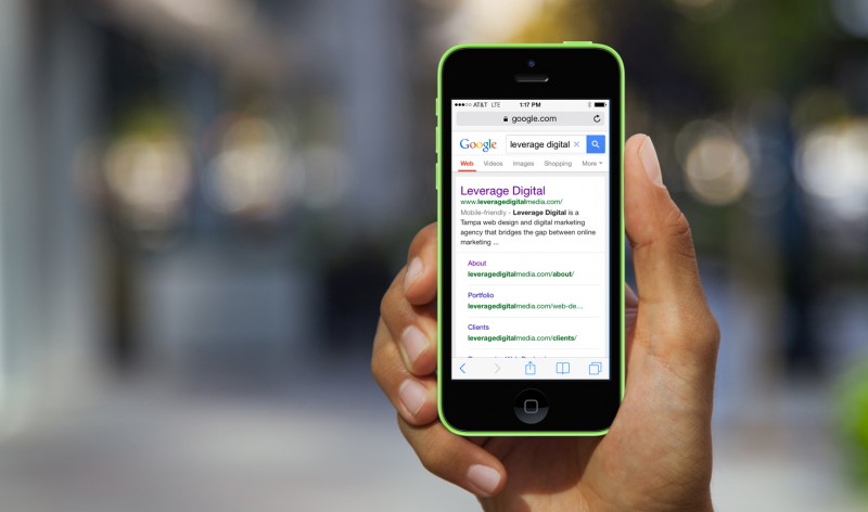

As a web design company in Tampa, we can confirm that having a mobile-friendly website can have a direct and substantial impact on an organization’s revenue. This should be reason enough to update your existing website if it is not designed with mobile use in mind, but now major search engines are giving businesses another incentive to develop an online presence that is in-line with consumer behavior, increased rankings. Bing, which also powers Yahoo, represents 29% of the search market industry, and sees 5.2 billion searches each month, recently made a big announcement in regards to mobile rankings. The first part of their announcement that was published to Bing’s official blog last month outlines the company’s ever-changing “relationship” with mobile. They began by saying how search results across desktop, tablet, and smartphone devices were the same in the past, but because as they state, “we live in a mobile-first, cloud-first world and we need to think about our users’ search experience on mobile devices differently.”
Why the Change? User-Experience.
If you’re wondering why this major change to Bing’s search algorithm happened, it can be explained in one word, user-experience. Bing identified, one, that mobile use is rising exponentially each year, and two, users are frustrated when they find search results that either don’t work because they use mobile-incompatible software like Adobe Flash or make it impossible to read and perform functions because text and links are too small. Bing’s solution the to changes in how people access information is to provide users with unique results based off the device they are using to perform a search. So, when a search is performed on a mobile device, mobile-friendly websites are given priority and rank higher than sites that are not mobile-friendly. This is big news for organizations that rely on search traffic to bring in new business, and can have a tangible negative impact on revenue if mobile rankings are lost for lack of a mobile-friendly website. It is important to keep in mind that two unique search results presents more work and more cost for Bing. So, for now they are crawling websites differently, but this might not always be the case and companies that do not embrace mobile could be completely removed from all search rankings in the near future.
How Bing Determines Mobile Rankings
1. Identifies and classifies mobile and device-friendly web pages and websites
2. Analyzes web documents from a mobile point-of-view by looking at: content compatibility and content readability
3. Mobile functionality (to weed out “junk”, that is pages that are 404 on mobile or Flash only etc.)
4. Returns more mobile-friendly URLs to the mobile SERP
5. Ranks the results pages based on all of the above
Bing Recommends Responsive Design
Mobile is not a growing trend, it is here now, and while it may have been easy to ignore the necessity of making the jump to a mobile-friendly website before, now there are real financial implications that will result from search engines removing listings that provide a negative user-experience. Another important consideration results from whether it is better to choose a unique mobile website or a responsive website that adapts to users’ screen sizes. For this question, Bing states, “we continue to recommend you use responsive designs over separate mobile (m.*) sites and ensure a great experience for users on all devices and avoid compatibility, readability, and functionality issues.”
If your organization does not have a mobile-friendly website, as a Tampa web design company that specializes in responsive design, we cannot stress enough the importance of making the change and redesigning your website to create a positive website experience for mobile visitors.